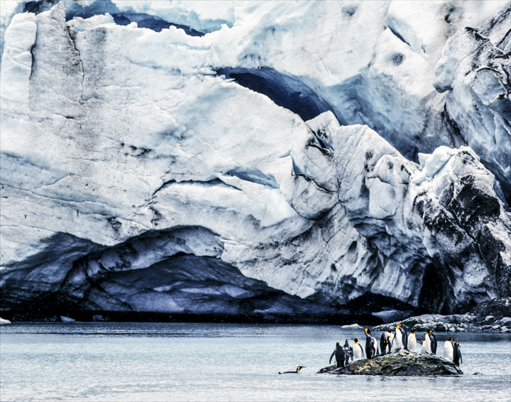
Here’s an oldie of mine that I took 20 years ago. Do you see the compositional error that makes me twitch every time I look at this photo?
The penguins are placed too close to the corner or the composition. It’s not a horrible composition but it is also not as good as it could’ve been. Moving the penguins out, away from the corner just a smidge would’ve improved the image. Not a big move but an important artistic tweak.
I think there is a certain visual discomfort when an important element of your composition is placed too close to an edge. I see this a lot in critiques especially related to the well known rule of thirds- people put subjects outside the one third compositional points and it just doesn’t look right. The placement is too close to the edge- it looks like a mistake or at least something unintentional and it makes whatever is placed there look uncomfortable.
So try not to compose so tightly that you have no recourse compositionally- give your subject some space, especially subjects that can move. No one puts penguins in the corner, and neither should you!


Dang, I really liked that one… the iceberg looooming over them……
Agreed regarding the iceberg looming. I think the corner/edge placement helps with that effect. My suggested tweak would have been to get some visual separation between the penguins and their background–if only you were ten feet taller!
I agree Daniel. I would like to be presented with the same situation again and see what I would do now. At least I am looking back and seeing improvements I could make instead of wondering how I did so well!